

Vela Website Redesign
COMPANY
Seniorlink
My Roles
Design, Prototyping, User Testing
Introduction
Seniorlink is a health services company that supports caregivers and their loved ones who need full-time assistance due to illnesses and/or disabilities. Their program, Caregiver Homes, pairs a caregiver and their loved one with a care team, consisting of a case manager and nurse. Through frequent visits, the care team provides emotional support, financial assistance, and guidance
Challenge
With the goal of using technology to improve collaboration between health care professionals and families, Seniorlink needed to modernize their web-based care management system. Caregivers log into this system every day to fill out The Daily Note, an online questionnaire that keeps the care team informed of the patient's health, behavior, diet, and incidents that may have occurred. Business wanted to provide more than the Daily Note; they wanted a system that caregivers could go to when they needed medical and emotional guidance.
As the company's first in-house designer, I was tasked with modifying and improving designs delivered by an external vendor. My most important mission was to ensure that the product was simple and easy to use by caregivers who were intimidated by technology. I wanted to make sure that this redesign was a delight and not an additional stress to their daily lives.
Understand
Most of the information I received in understanding the challenge came from the business. In my first months of taking on this role, I felt like I was designing in a bubble and asked my boss if I could meet a few caregivers and case managers. I finally had the opportunity to do so in Indiana with usability testing.
Business
Stakeholders had a hard time understanding the redesigned features and were not comfortable launching the product yet.
Seniorlink wanted to provide more reasons for caregivers to use the system beyond filling out the daily questionnaire.
They wanted to leverage the amount of information they've gathered on caregivers and patients in order to be the top resource in caregiving.
They wanted to create a product that wasn't exclusive to Caregiver Homes and could be used by other health care services.
Users
There were 2 audiences I had to design for: the caregiver and the care team.
Based on case studies from Caregiver Homes, this is what I initially learned about caregivers.
Caregiving is a difficult, yet rewarding role that involves a lot of sacrifice. Some caregivers rely on Seniorlink's financial assistance because they had to leave their full-time job to take care of their loved one.
Most caregivers in the program were ages 40 and above and were taking care of their parent.
Caregivers filled out the daily questionnaire at the end of the night.
Business believed that the majority of caregivers would struggle with the updated website.
Based on speaking with people from the business side, this is what I learned about the care team.
Nurses and case managers made visits to each home every 2 weeks.
They would often travel long distances in between each home.
They had about 20-30 cases, which meant they had about 20-30 questionnaires to read through and follow up on through text and call.
Analyze
By understanding the caregiver's journey and points of interaction with our system (eventually branded as Vela), I determined which features needed to stay in the redesign.
TAsk Flows
The research gave me an idea of what the user journey was and helped me prioritize the tasks:
Caregivers
View/schedule appointments in the calendar.
Complete the daily questionnaire as a task marked in the calendar.
Chat with members of the care team
Case Managers
Follow up on daily questionnaires. Questionnaires flagged with hospitalization and major incidents are addressed first.
View calendar to see which homes to visit for the day.
Take notes.

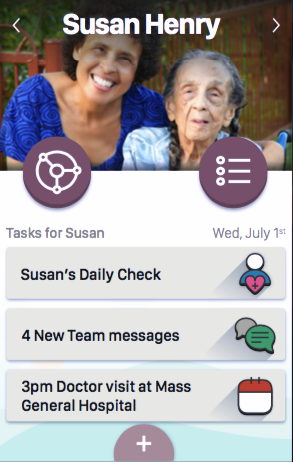
Design
For each task flow, I did a rough sketch of the screens and designed them on Sketch. The 4 major features were: calendar, chat, file sharing, and team profile.
A major change I pushed for was the navigation in the mobile web view and app. The initial design had a unique site structure that didn't follow typical navigation patterns. For example, two circles in the middle of the page represented the menu and chat buttons that were not easily identifiable by most people on the team.
Thinking about who our audience was, it was important to keep UI patterns similar to other apps they're familiar with. Rather than hiding features behind the menu/hamburger button, I decided that having a tab navigation at the top would be better for this audience.
The navigation is persistent. Users will know where they are on the site.
Users will know what the major features are and can get to them easily.
Another important aspect was accessibility. We're dealing with an audience who are likely to have motor and visual disabilities. The brand colors were a very light green and blue color that didn't pass the color contrast checker on WebAIM when paired with either white or black font. I came up with a darker shade of green that passed WCAG guidelines and got it approved by the brand team. I also made sure the font sizes were increased.
Initial Design: The initial redesign had a unique site structure that didn't follow typical navigation patterns.

Test
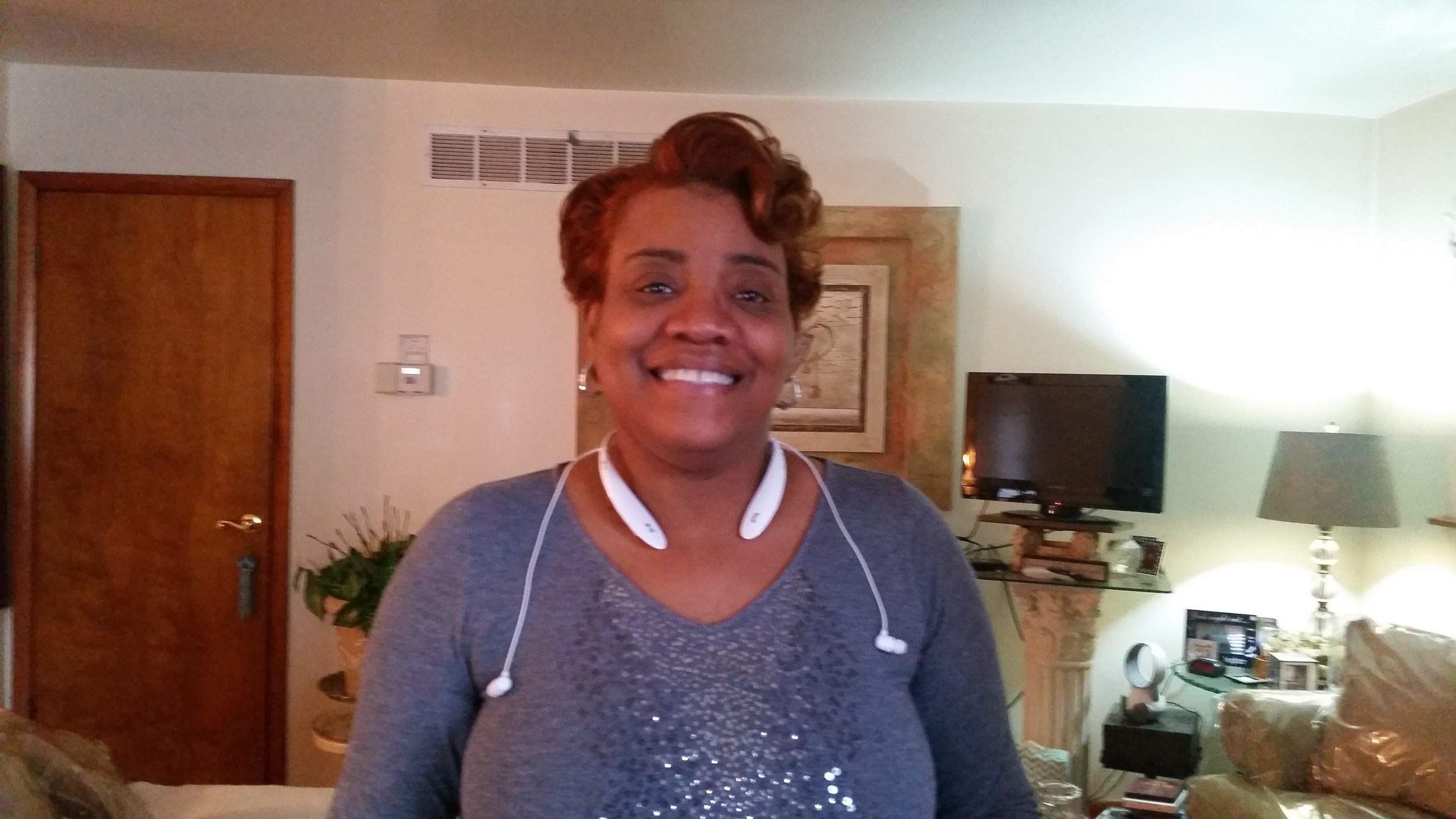
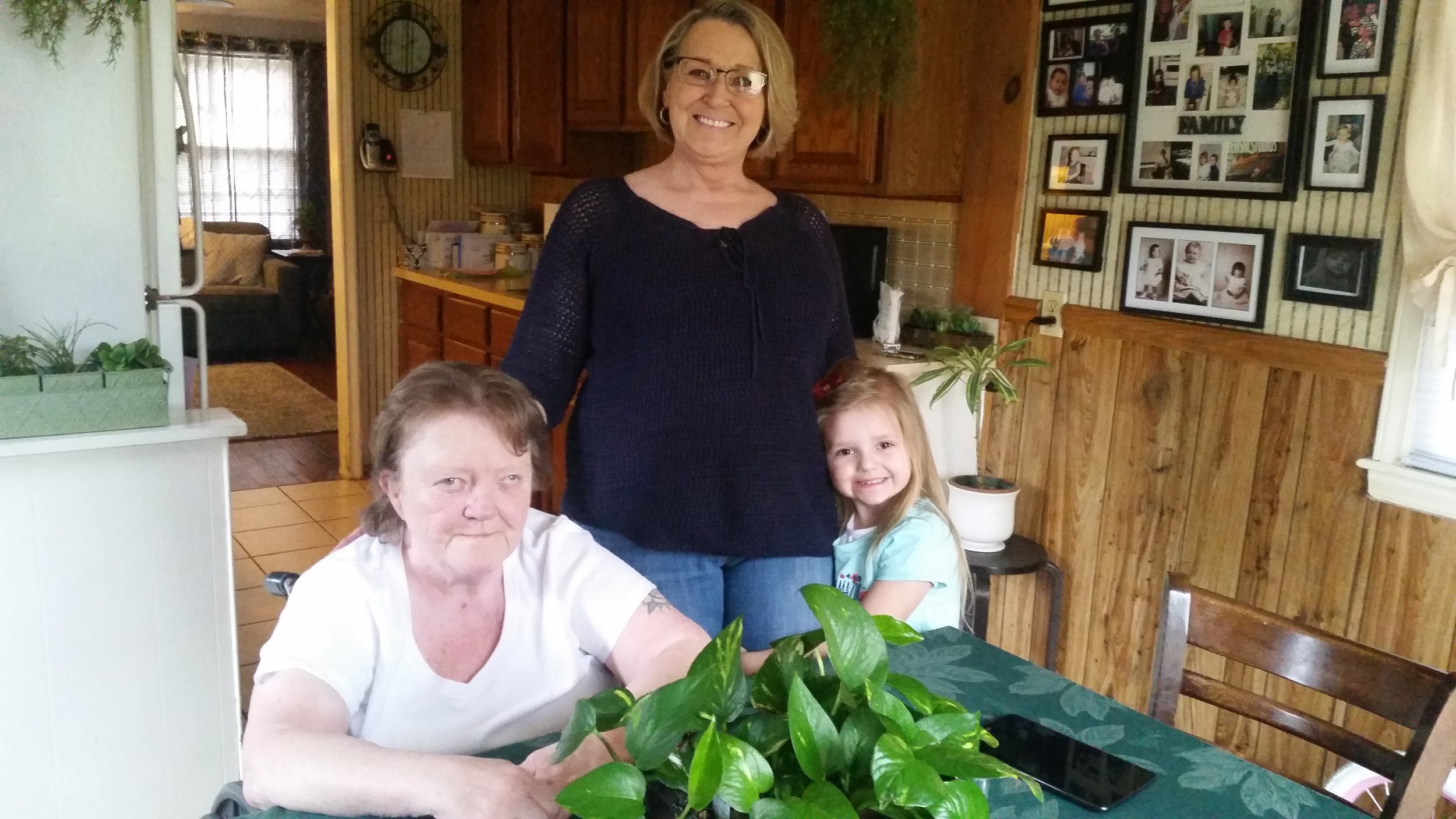
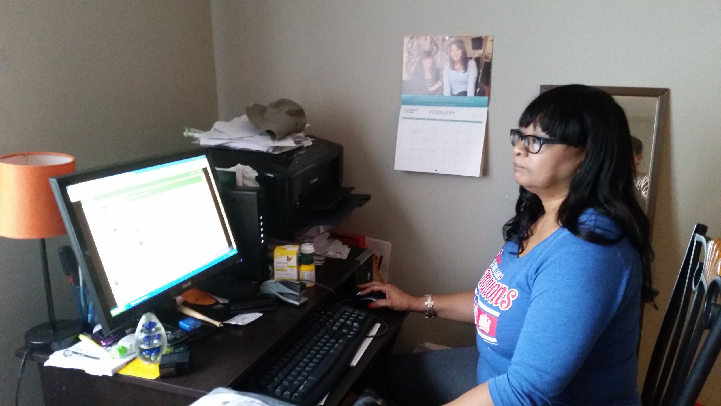
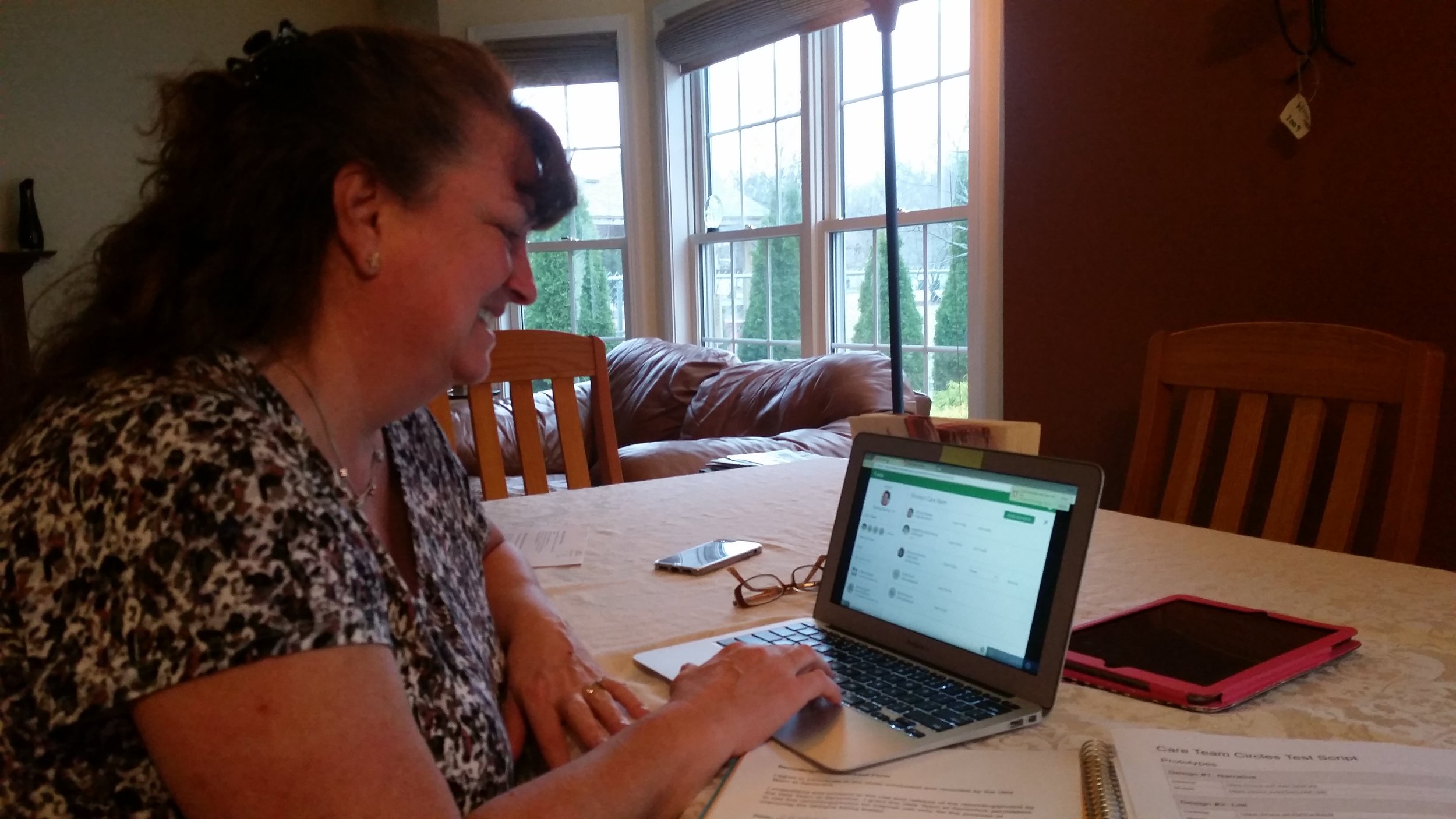
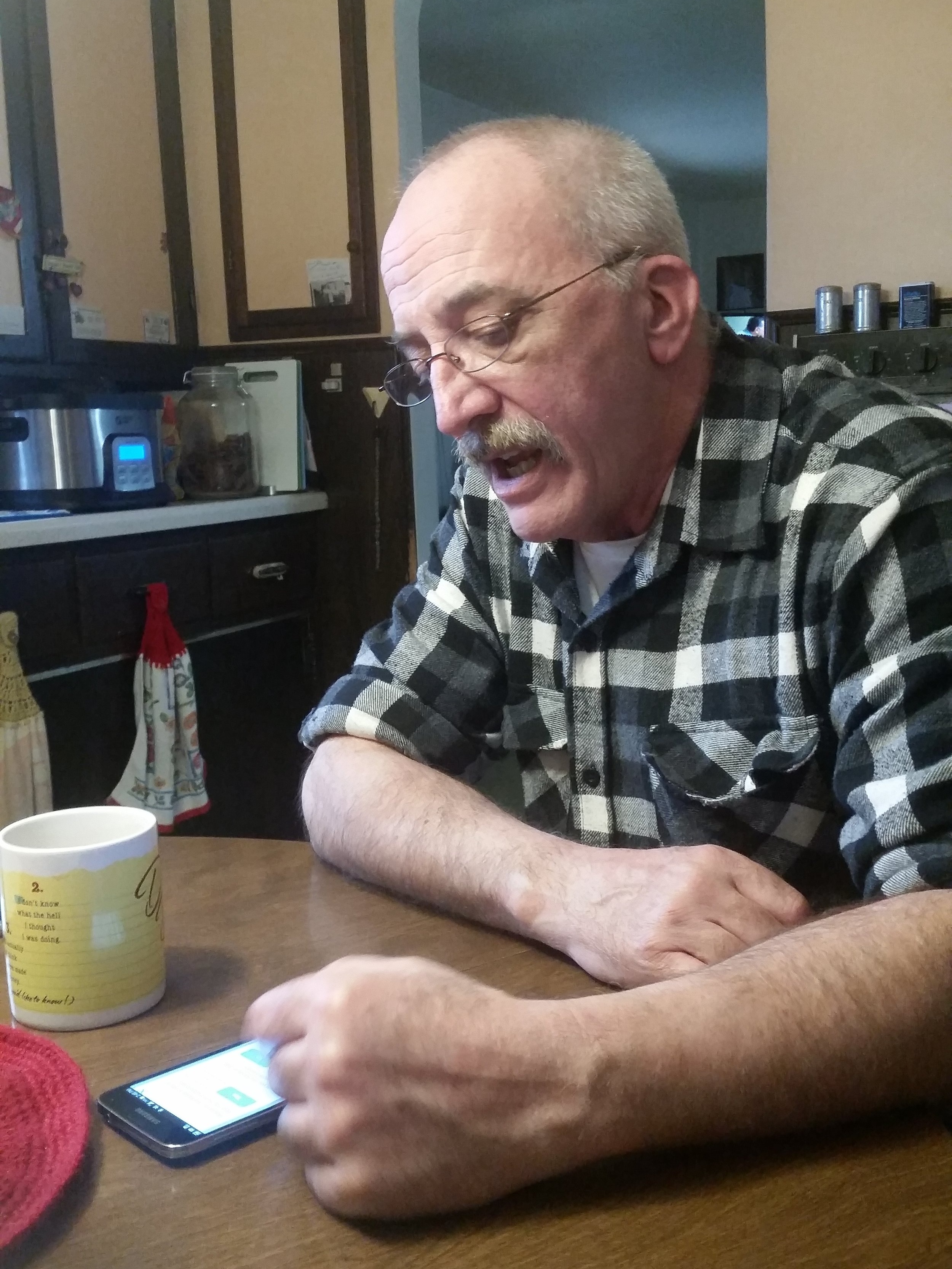
In Indiana, I teamed up with the product manager to conduct usability tests at caregivers' homes (shown in pink in the map below). I created the script/guidelines and the test prototypes, both desktop and mobile to cover the different devices our caregivers used. As we learned what didn't work, I made quick modifications of the prototype to verify the pattern of what worked with the next person.
Vela received really positive feedback from both the care team and caregivers. For caregivers who weren't comfortable with technology (which was a smaller number than we thought), they were able to complete the usability tasks. Once they became comfortable, they thought Vela was simple to use.
The Caregiver Homes staff was very enthusiastic about Vela. For the care team, Vela made their workflow run smoothly. They were able to type their notes into the system right away instead of waiting until the end of the day.
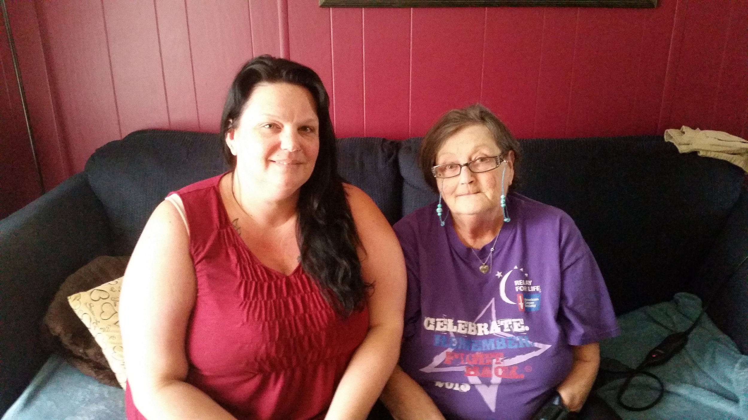
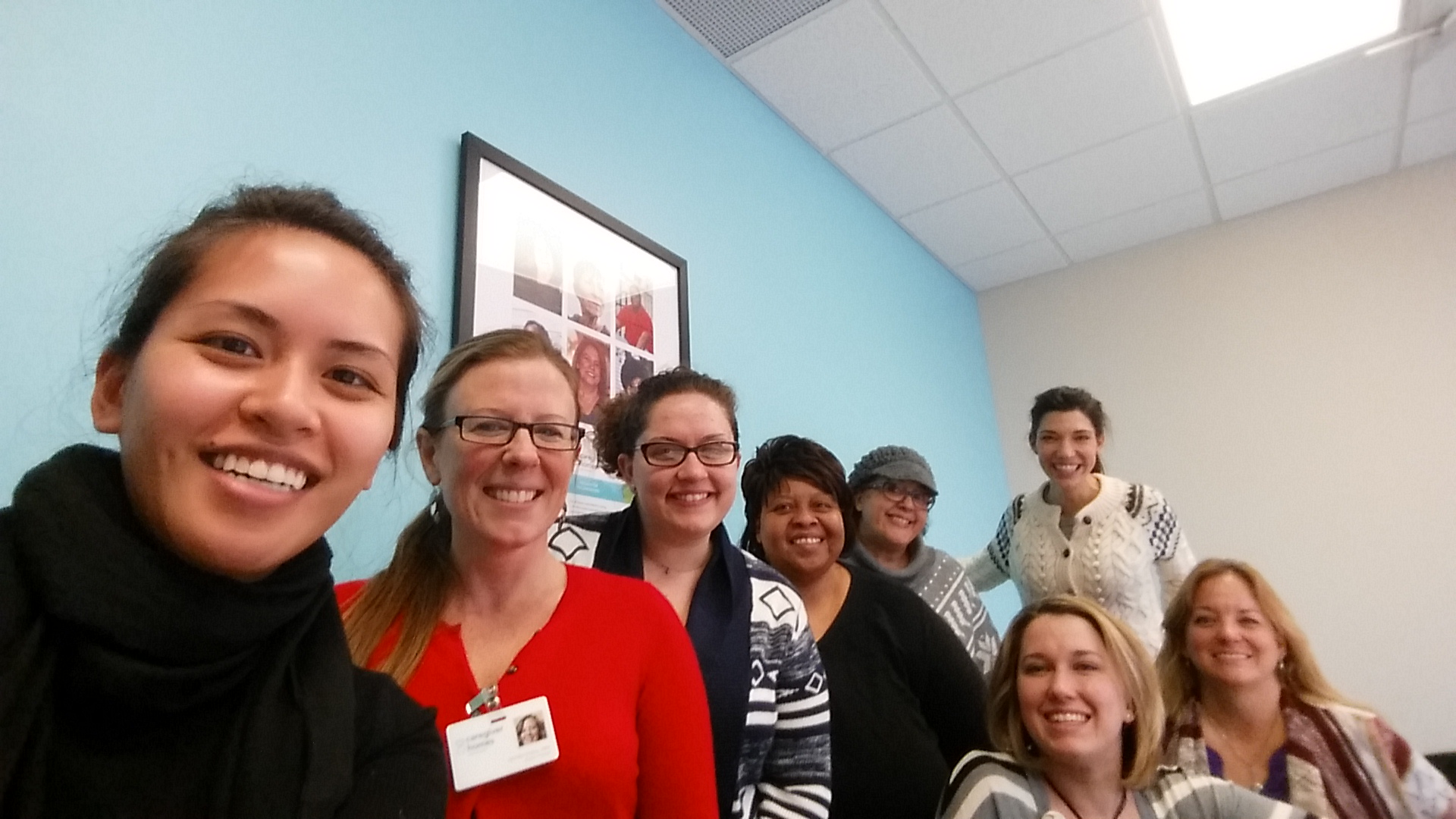
It was enlightening to see the faces of whom we were doing all this work for. I created an album of our trip and shared it with the team to remind us of our reason why we're building Vela.

Here are some of the faces who brought so much value to the work we did. They are the reason why this company exists. They are the “why” to our work.
Lessons Learned
Having the experience I have now, I would have set a design process where the design, dev, and business teams have workshops to discuss requirements, I would have held more frequent design reviews with the development team and stakeholders so that we're all in agreement.
What made my experience valuable here was working directly with each developer and understanding the developer's mindset. This enables me to empathize and collaborate well with engineer teams in any organization.
I experienced the difficulty of being a UX team of one but also the excitement of introducing new processes, such as usability testing, to a company.